UX and UI: On the Front Line of Accessibility
Common Origins of Accessibility Issues
- Brand and/or Interface Guidelines
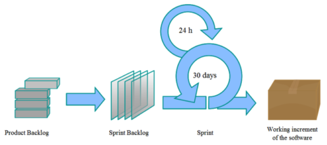
- Product Backlog (BA)
- Sprint Backlog (UX)
- Sprint Backlog (UI)
- Sprint (Development)
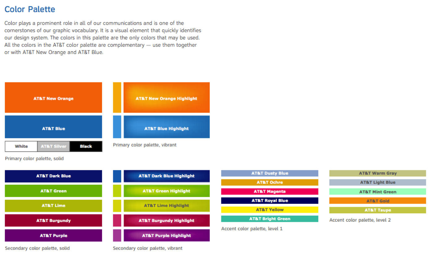
AT&T Brand Guidelines
AT&T ca. 2005

![]()
“AT&T Brings Back Cingluar Orange to “Mobilize” its Brand”Gizmodo, September 2007
AT&T Brand Guidelines
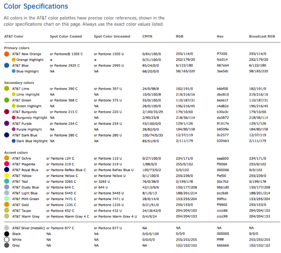
AT&T Brand Guidelines
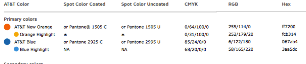
AT&T Primary Colors Against White
| Color name | Foreground | Contrast | Level A | Level AA |
|---|---|---|---|---|
| AT&T New Orange | #ff7200 | 2.74:1 | Fail | Fail |
| Orange highlight | #fcb314 | 1.81:1 | Fail | Fail |
| AT&T Blue | #067ab5 | 4.72:1 | Pass | Fail |
| Blue Highlight | #3aa5dc | 2.76:1 | Fail | Fail |
AT&T Primary Colors Against Black
| Color name | Foreground | Contrast | Level A | Level AA |
|---|---|---|---|---|
| AT&T New Orange | #ff7200 | 7.66:1 | Pass | Pass |
| Orange highlight | #fcb314 | 11.6:1 | Pass | Pass |
| AT&T Blue | #067ab5 | 4.45:1 | Pass | Fail |
| Blue Highlight | #3aa5dc | 7.6:1 | Pass | Pass |
![]()
“After spending an ungodly amount of money to kill Jack and mutate the Cingular brand into the "new AT&T," they've decided that Cingular's orange palette offered a "younger, edgier and more contemporary style—all attributes closely associated with wireless." But clearly not AT&T. So, they're rebranding. Again. Look for Death Stars set against the new "primary corporate color," orange, and a series of commercials directed by Wes Anderson coming your way as of — yesterday”Gizmodo, September 2007
AT&T Brand Impact
- 16,000 Retail Stores
- 1,500,000+ pages on att.com
- 460,000+ pages on att.net
- unknown number of pages on uverse.com
- Hundreds of products and services
Humana circa 2012

Humana 2014

Common Origins of Accessibility Issues
- Brand and/or Interface Guidelines
- Product Backlog (BA)
- Sprint Backlog (UX)
- Sprint Backlog (UI)
- Sprint (Development)
Issue Source: Brand and/or Interface Guidelines
- Color contrast
- Graphic and color use
Issue Source: Product Backlog (BA)
- Missing accessibility platform requirements
Issue Source: Sprint Backlog (UX)
- Layout problems
- Multi-device interactions
- Graphic and/or color use
- Error handling
- Missing explicit information
- Missing personas with disabilities
- Overall page navigation issues
Issue Source: Sprint Backlog (UI)
- Color contrast
- Informational graphics
Issue Source: Sprint (Development)
- Semantic Markup
- Structural Relationships
- Keyboard Interactions
- Reading order
- Name, Role, Value and State
- ...